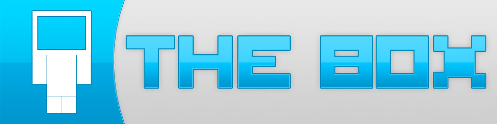
I presented my first logo, and a second to a small feedback group to gauge their reaction to the logo and the ideas behind it, as well as the colour scheme.
The logos presented were the one seen previously:
And a new design with a different approach:
The feedback receieved was mostly positive, however it's highlighted the drastic impact shape has on the way a logo is received. Due to the square shape Logo 2 was interpreted to be better for use in traditional media - film and TV. While Logo 1 was seen as more Web orientated due to the rectangular and header-like design.