Pages

Sunday, 21 November 2010

Planning

I have began to plan the themes and contents of my media products. This involved sitting down and drawing both a mind map, and a story board / sketch of my ideas for the over all themes, the poster and the ident.

Although the website is a primary task, once a theme has been developed and implemented in both the ident and the print advertisement, the web design element will be straight forward to port across.


I have made two videos of my planning session showing the progress I made, as well as finalised versions of them in a large readable image.


You can see the images below:

The basic plan is to focus on the urban night. But to do so in a way that highlights the way technology is lighting up the dark so to speak, as opposed to the gritty underworld feeling that the night can connote.

The plan for the ident is to replace cars with computer generated blocks of coloured light, they will represent pixels and will be seen performing typical traffic things before pulling up at some traffic lights at a red light. As the cars bunch up the camera will zoom up into the sky (CGI) and their colours will reveal the logo from above.

The Print Ad will continue this block of light feel, replacing buildings or other mundane urban objects with the logo illuminated.
 

Thursday, 18 November 2010

Photographic Techniques: Planning and Aims.

In order to get an idea for the requirements of my print advertisement and the following ident, and web design I am planning to go into urban environments in order to find locations to either film or photograph. In doing so I hope to mimic some of the styles below, and to find ways of merging what I want in terms of photographic style with that of the idents I have analysed below.
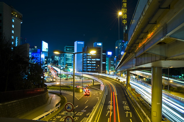
One particular technique I would like to experiment with is a long exposure on movement, especially in urban environments such as below:
Similarly the use of the Bokeh technique of blurring, to produce aesthetically pleasing points of light.


I hope to demonstrate my ability to use photographic techniques such as  Framing, lighting and to gain possible locations / images to use for the various mediums my products must be in. I will post afterwards analysing my findings.

Wednesday, 10 November 2010

Idents

The definition of an ident is the following:
Idents - Station identification is the practice of radio or television stations or networks identifying themselves on air, typically by means of a call sign or brand name (sometimes known, particularly in the United States, as a "sounder" or "stinger", more generally as a station or network ident).
As part of my production involves one, I have been researching into examples of ones I would like to take inspiration from. I've found the following examples of ones I think fit the ideas of where I'd like my Channel's theme to go:

DR2


I think the audience for such an ident is going to be male, and an older male audience at that. The slow plodding music gives it a humorous feel but compared to a channel aimed at the youth market, they are a very slow paced ident. Similarly the quirky contraptions may not suit the brash and loud humour of the stereotypical youth and may reflect a more intellectual audience. The style is very simple and one I think I could mimic, a coloured background and a panning camera would be easy to accomplish, and the quirky contraptions would reflect the techy / gadgety audience that I am aiming at.
Dulux


Although not strictly an ident, this Dulux advert's style, use of music and camera techniques are great examples of things to use for my own ident. The mise-en-scene within it, typically schools, kitchens, dark corridors and car parks reflects a family target audience of Mum and Dad. The music by Jonsi, lead singer of Sigur Ros an icelandic alternative band, could be argued to be more aimed at the female audience on a stereotypical level. The use of time-lapse gives it a sweeping sense of rapid change. I could easily emulate this with the right software however the nature of a timelapse means that an enormous amount of time would need to be spent to gain a short amount of footage, this may prove impractical.
SBS


Fresh colours and a gentle piano melody gives to me infers a female target audience. The simple shapes and colours coupled with this music suggests an older audience too, a younger one would have a far more loud and vibrant ident with heavy music and in your face colours. I don't think it would suit the target audience of my channel - however the technique of vector animation and simple shapes could be emulated easily to fit.
Fiver


A good comparison to SBS, using a similar technique of simple shapes and colour an entirely different feel has been acheived by the dark background and more overt music. The way the shapes merge and form into the various genres the channel broadcasts is a clever way of implanting it in the audiences mind. Particular references like the unzip, and the computer terminal flashing cursor at the end lead me to believe it is a male young audience. Cliché terminal looks and such I am keen to avoid to prevent my channel being too far down the track of geek to warrant a large audience but the method of animation is one I can replicate.

All of these demonstrate similar conventions. Primarily a clearly defined logo visible either at the beginning, the end of all the way through. They are also all within the length of about 30-45 seconds (excluding the advert) and contain very little on screen. The music employed is typically simple with no vocals and contains no introduction or climax, essentially being nothing more than a melody rather than a song.

Thursday, 4 November 2010

Semiotics in Media

Semiotics is the way in which symbols and icons provide meaning to us. For example, the trusty red slash through an object which to British audiences at least signifies that anything contained within this or is overlayed by this is forbidden.

Semiotics can be broken down into three main branches:
  • Icons
  • Indexes
  • Symbols
Icons:
Icons are indistinguishable from the entity they represent. By this I mean graphically they are exactly as depicted. A prime example of this is the Trash Can icon on a computer - its meaning is just that, a trash can thus its image is a trash can. Icons are extremely important in a User Interface, so for websites they are crucial to help user navigation.

Indexes:
Indexes are connected to their meaning, but are not a direct representation of it. A photograph of smoke on the horizon will imply that there is a fire beneath it. They indicate a meaning and are not limited to visual means, smells can be indexes too. For media products, sound and vision would be the only types of indexes available.

Symbols:
A symbol is neither an indication of meaning, nor is it a direct representation. It's meaning is derived purely from convention within the audience. This generally means they are far more susceptible to the impacts of Social and Cultural relativism than the other two (smoke implies something burning in all cultures, a bird symbol does not). Symbols tend to be logos and brands for companies, for example the coloured squares of Windows, the blue-backed F of facebook and the circular swirls on the BBC One idents.

On a typical website you would expect to see all three.


An example of an index, the large high skyscrapers and sprawling city accompanying a story on successful business gives an indication of that. Small business prospects do not produce such large buildings, and in our culture a big building is always a sign of success (large home, wealth etc).

Examples of Icons. The weather is represented by a graphical version of the condition. There is no way an image of a cloud with the sun poking out behind it can mean anything other than, in this context, a cloudy day with some sun.

A Symbol. The cut out of BBC in white blocks only means the BBC because of the convention of using it with BBC produced media. Without this they would simply be three letters in a peculiar font. 

Monday, 1 November 2010

Textual Analysis of Various Websites

Like all media, Web pages are tailored towards a specific Target Audience / Market. Below I shall analyse two contrasting markets - the male orientated Dave and the female orientated ITV2.


Dave's website is designed to fit in the gentleman's club parlour art style demonstrated on the idents. The dark floral wallpaper and up light images really capture this atmosphere. The little touches such as picture frame borders further enhance this dark, even seedy, guilty pleasure that is a channel designed for panel shows, male magazines such as Top Gear and sit coms. The dark red used on the navigation and login - the highlight colour as explained in the Colour Theory post - has connotations of the "underworld", a boudoir-esque feel acheived through one simple contrasting colour.

On the polar opposite of the scale of Gender related websites, ITV2 demonstrates in just the background alone which audience it caters for. The made up woman and smart-casual dressed male is not something a male targetted media text would contain as the largest "surface area" of the page. Furthermore the big advertisement for one of the channel's shows entitled "The Only Way is Essex", women stood in posed positions are crucially not sexualised in the way a male audience would respond to. Sure, they aren't ugly but the toned down clothing and stern faces seem to be showing female strength rather than the typical "come to me big boy" look.

The colourscheme of the site is also an indication of its target age range. The almost garish lime green implies its intended for a younger audience. Older women would stereotypically prefer pastel shades in calmer colours, this is very in-your-face. The programming also backs this up, older women who are perhaps of a higher income would not want to watch fly-on-the-wall documentaries of Katie Price (generally speaking).